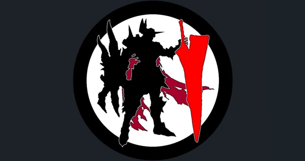
If you follow SCPortal on Twitter, you probably know that I was looking for a new logo to use in the last few weeks. And today is the day to start using it.

The old logo wasn’t straightforward bad. But it had several issues that bothered me a lot:
- Firstly, it was actually the game logo of SC6. It was nothing of “our own” kind. And being the SC6 logo meant that once SC7 will be a thing (yes, I still hope for it), it will be obsolete.
- Another issue was the recognizability – especially in small formats, it was simply a blend brown circle with two black dots.
- And last but not least, for me personally the big issue was that this logo was “stolen”. I know, it was simply a game logo with game artwork. But still…
So since today, we have a new logo that is, at least from my perspective, better suited for SCPortal’s needs and uses.
Anyway, there were some alternatives and “on-demand” attempts shared on Twitter, which you may check hereunder:
And Zas in silhouette is simply a hooded guy with a scythe.
— SoulCaliburPortal (@CaliburPortal) July 16, 2021
In a sense, he is kinda like Mitsu. He looks awesome but will fit into dozens of games while SC will not be one of those coming to mind pic.twitter.com/6xmQFmmqYl
